
With the newest additions to our wide range of fabric selections, there sure are a ton of choices. It’s enough to inspire a new look for any piece of furniture. What happens if you find a bold color fabric that doesn’t match the rest of the room? That means a new color scheme may be in order.
How can you update the color scheme in a room to reflect a new piece of upholstery? Working with a color palette will be your best bet. We’ve covered matching upholstery and décor to a specific color palette. But what happens when your furniture is the starting point? You’ll essentially need to create your own color palette.
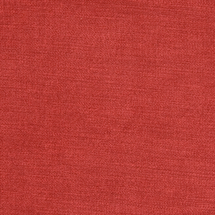
Let’s say you want a bold color, like this burgundy red velvet selection:
It’s easy to create a digital color palette based on this color. There are tons of free online color palette tools. One example is ColorExplorer.com. You can create color palettes by choosing your upholstery color, importing a photo, or working with digital color decks.
Using the slide tool, you can find a burgundy-red shade. It shows complementary shades of dark red, chocolate brown, russet orange, light grey, and slate grey. Then, you can match those hues in other décor pieces, wall paint, and upholstery selections. The living room photo above shows how well the complementary red and gray colors work together.